
I meant to publish this post almost a month ago when Instagram started allowing non-square image sizes, but then I moved to Philly and my life got flipped, turned upside down. But now I’d like to take a minute, just sit right there and I’ll tell you how I became a critic of an app called Instagram.
To be perfectly candid, I was a little disappointed by Instagram’s elimination of the square image requirement. I suppose I’ve always liked the simplicity (and perhaps the challenge) of taking the right photo, cropping, zooming and positioning it oh-so-perfectly. The OCD part of me very much likes the perfectly square formatting that Instagram has always embraced.
I’ll openly admit that Instagram has kind of sucked for panorama images. You could add empty space on the top and bottom, but that greatly reduces the amount of image space by somewhere between 30% and 60%. I firmly believe in using the whole space whenever possible – remember that Instagram is designed for mobile devices, so the images displayed on them are much smaller than on desktop. A widescreen image with bars on the top & bottom might measure 1.5″ by 3″ on the average phone – that’s pretty dang small and the detail you’d generally find in a panorama photo will largely be lost. My rule of thumb was to save panorama photos for elsewhere (Twitter and Facebook cover photos come to mind), or crop them into a series of three and post them in sequence.
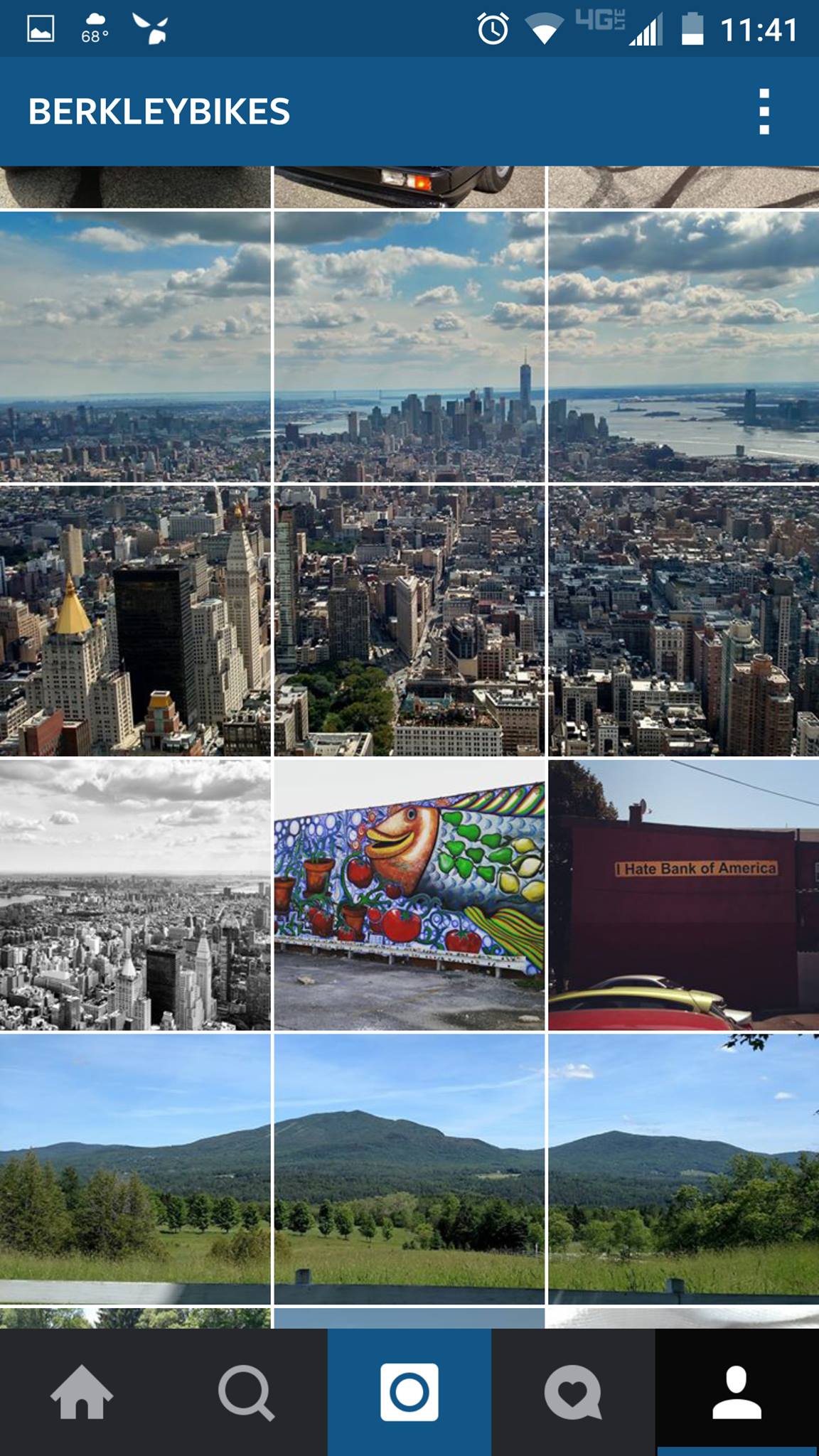
Instagram photos in sequence – both a three square and six square setup.
Removing the 1:1 aspect ratio requirement raised a lot of questions on my end. Mostly, how non-square images would play nicely with an app that’s designed entirely around square formatting.
As it turns out, non 1:1 photos appear the way they were posted in the news feed or when viewing a specific image. When looking at them in a grid view, they’re cropped to a square viewport. Therefore, posting portrait-style images is great, because you get to utilize more of the screen. Landscape images still mostly suck, because you’re still limited to the smaller view space, minus the empty space you were formerly required to include.
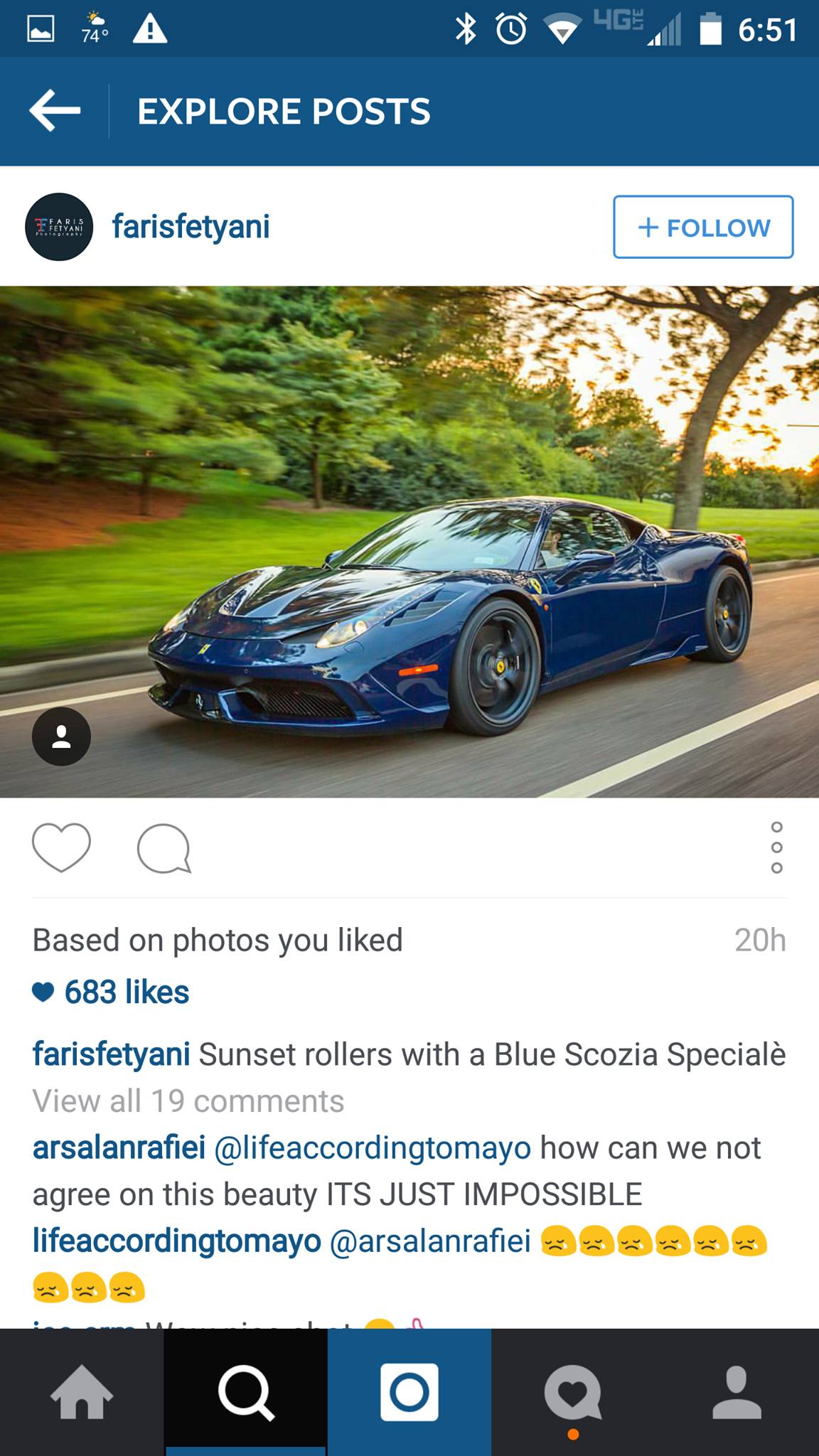
How a landscape photo appears in the news feed. It takes up very little space.
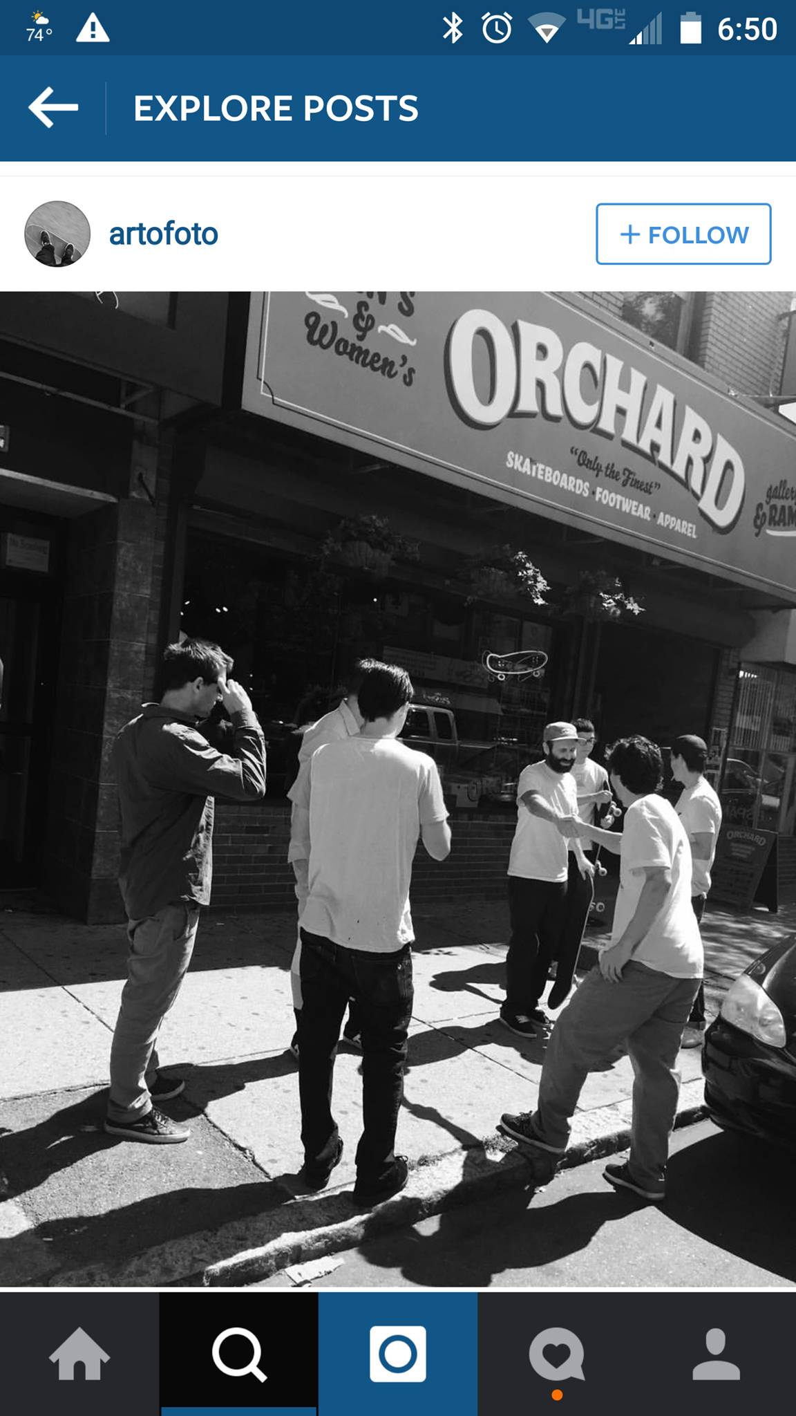
How a portrait photo appears – note how much space it uses.
Instagram’s Oversight
What would have REALLY made widescreen aspect ratios ROCK is if you could rotate your phone and look at them in all their glory. For some reason, Instagram STILL doesn’t allow for this, and they’re losing out. For a mobile app that’s dedicated to images, you would think they could better allow for the display of wide-screen images.
C’est la vie I suppose. Oh well, maybe in the next release.
