Before you read any of this, understand that what’s in this post is not guaranteed to be fact. Much of this information is anecdotal based on phenomena I’ve encountered. In my defense, almost anything you read about this topic is somewhat anecdotal – none of us have a picture perfect idea of how Google’s internal processes work. I welcome and encourage you to leave questions and comments.
In November of 2016 Google’s Webmaster Blog announced the long term goal of moving toward a mobile-first search index. This could have a fundamental impact on search rankings, although it remains to be seen whether it’ll truly be impactful, or go the way of the first mobile-friendly algorithm update, which had minimal impact overall.
How It All Works
First, let’s do a basic recap Google’s process for crawling and indexing web pages. While we don’t know the intimate details, we at least have a high level understanding of how the process works.
Google’s web crawlers (bots) periodically crawl websites and index the content. They follow links to find additional pages and take into account on-page optimization like titles, H headings, body content, images, video, etc.
There are two versions of Googlebot – one for desktop and one for mobile. Similarly, there are two different indexes (also desktop & mobile). At present, the desktop index is the primary index to determine where a page will rank in search results. Traditionally, desktop has been the primary traffic source and was responsible for the majority of searches. Now Google is claiming the split has shifted in favor of mobile.
Exactly how Google rectified differences between the two indices is not well known. For example, a page that provides a phenomenal desktop experience could easily provide a very poor mobile experience if it’s not responsive. When that’s the case, what does Google do? Does it index and rank the page in desktop search results, but not on mobile?
Doing so would provide a very inconsistent searching experience across devices. Imagine if you ran a search on your phone then replicated it later on desktop and you were presented with a completely different set of results? That would be confusing, right?
Mobile Penalizes Desktop
It has been my experience that even though the mobile index is not the primary, it does directly influence desktop rankings. Several months after going responsive, an education client I worked with saw big increases in desktop rankings after the second mobile algorithm update in 2016 (in addition to big increases on mobile).
This backs the theory that in an attempt to present a consistent user experience, Google links the two indices, and mobile, the “secondary” algorithm could have a significant impact on desktop. In effect, we believed their non-responsive site was limited on desktop because their mobile experience was poor. When the algorithm rolled out, we saw big increases on mobile and in order to preserve the cross-device user experience, that necessitated big increases on desktop too.
Influential Pages Can Overcome Algorithms
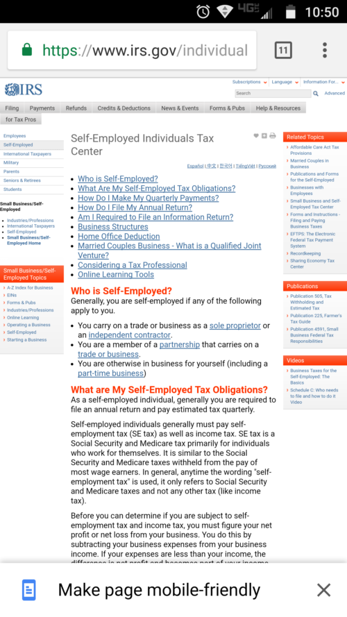
It has also been my experience that a poor mobile experience does not automatically disqualify a page from ranking well on mobile OR desktop, if the page is sufficiently relevant or influential. Large swathes of IRS.gov are not mobile responsive but continue to rank well on both desktop and mobile.
They have to – it’s a critical government website that millions of people rely on. Despite the poor user experience, Google can’t penalize these pages too much. It would create serious issues if they did and searchers couldn’t find them. So Google continues to rank them, which may be a function of how frequently they’re cited on other sites (have many backlinks they have).
Making Pages Mobile-Friendly
How does Google rectify the fact that it’s ranking non-responsive pages? In September 2016, Google quietly updated Chrome with a feature that gave users the option to “make a page mobile-friendly.” Perhaps recognizing that the user experience of these pages was lackluster, Google offered users of its browser the option to change that.
Un un-responsive IRS page. Note the “Make page mobile-friendly” CTA:
After clicking “Make page mobile-friendly:”

It’s a band-aid fix to an underlying problem, but it does work well on the client-side. As a site owner, I might not be so convinced, depending on how Chrome renders the site. If important CTAs or contact forms are relocated in manner that’s not optimal, it could impact conversion rates.
Moving to a Mobile-First Index
It’s clear that Google has been incrementally pushing sites to provide a better experience. The mobile-first index is just the next step in a long series of steps to provide a better user experience.
What’s the impact going to look like?
It’s hard to say. This is a huge shift – it may be rolled out in phases like the two mobile-friendly algorithm updates were. The first phase may be less impactful to test the waters.
Google’s John Mueller did state that mobile pages should have all the same features as desktop pages, which makes a strong case for a responsive site rather than dedicated m. sites or dynamic serving sites, but it’s impossible to know for sure.
The mobile pages should be fully equivalent in content & functionality regardless of indexing, right? Why wait to fix that? Users care too.
— John ☆.o(≧▽≦)o.☆ (@JohnMu) June 19, 2017
Despite the initial Fall 2016 announcement, Gary Ilyes has indicated the timeframe for release is now sometime in 2018. So there is time to make changes, not that Google has provided any formal criteria or us to follow.
AMP Pages
Perhaps most perplexing is that Google has simultaneously been pushing AMP pages over the past year – AMP pages are a lightweight HTML framework that results in lightning fast load times, at the expense of more advanced functionality (CSS and Javascript execution have significant constraints).
Will Google bias its own products and let AMP pages pass the test? Or will reduced functionality preclude them from ranking as well as responsive desktop pages? I’m curious to see how Google will accommodate these pages.
Takeaways
We know very little, so it’s difficult to determine how this update will affect dynamic or dedicated m. sites, which seem to be the most at-risk. Responsive sites could see a negative impact, if mobile functionality or navigation isn’t consistent with desktop. Despite being the secondary index, desktop may play a larger role than mobile did. It would be smart for Google to weight the secondary desktop index heavier than it did the secondary mobile index, at least when the update initially rolls out.
Questions? Comments? Tweet at me (@BerkleyBikes) or drop a comment here!
